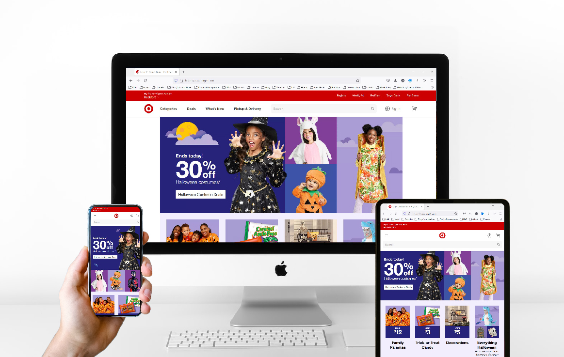
Mobile Platform vs Desktop Platform in Relation to Planning and Executing Web Design:
Due to the nature of the mobile platform, it differs greatly compared to the desktop platform. Meanwhile, keeping the website consistent between the two platforms.
- Users will use their fingers instead of a mouse. This will mean tapping, rather than clicking.
- Users tend to swipe left to right. This allows for information to easily slide in from left to right, such as when using a gallery.
- The screen size is much smaller on mobile than on desktop. This will allow for less information to be seen at first glance on the mobile than on the desktop.
- Scrolling up and down is common practice on the mobile, and because of this, it is becoming more common on the desktop. It used to be said that scrolling was bad for desktop and will send users away.
- The orientation on mobile is portrait, where the desktop is landscape. This will change the orientation of the navigation as well.
- There should be less information on the mobile page due to it's size, but the information should still be available with a tap. The content must be prioritized.
- Integrative functions are key when creating mobile websites. The website should integrate with the phone's apps. Such as maps and calling. This is very helpful when moving around - thus the mobile experience.
- Situational design for mobile reminds us that when users are on the go, they get distracted easily and move on. Easy to navigate, and to the point is best practice for mobile.
- (Enginess, 2021)
