Development of a Responsive Website
Creating a responsive website hasn't been without it's challenges. When converting this site into a responsive website, the most important thing to add was the meta viewport tag in the head of the HTML code. Next, adding media queries to the CSS. This meant changes would be need to be made to the CSS in order to accomplish modifications to the view based on the different screen sizes used in the media queries. Image dimensions had to be adjusted, columns had to be added, the hamburger menu had to work properly, and all of this had to be accomplished without any of these adjustments affecting the original look of the mobile-first design.
For example, I had to add article tags in order to incorporate columns, and these article tags affected some of the spacing and padding in the mobile design, which had to be adjusted. Creating responsive columns was perhaps the most difficult task that I have had to accomplish so far. I have never done it before, so I had to research how to do it, figure out why it wasn't working, make adjustments and make changes, make adjustments and make changes, make adjustments and make changes, make adjustments and make changes, make adjustments and make changes... this went on for quite a while. Finally, stumbling across the correct way to code it, in order for the site to go from one column to two once the meta viewport tag flagged a screen size of tablet or above.
I am not in love with the way it looks, but the task was accomplished. I suppose there will be design limitations until I work more with columns, and do more research on the different ways of incorporating columns into a website.
I then tested the website using by running it through the HTML validator: https://validator.w3.org/, and the CSS validator: https://jigsaw.w3.org/css-validator/.
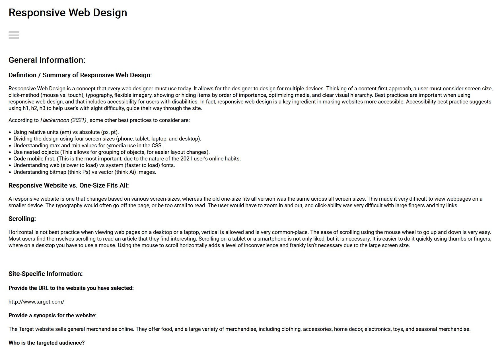
The previous, non-responsive version of this website is seen in the image below. As you can see, even on the larger desktop version of the website, it is showing a mobile-first appearance.
